Juneau
Improve the information seeking process to help first-time dads navigate the postpartum journey.
Background
Designing for caregivers is uncharted territory for Premera Blue Cross, a healthcare company in Washington and Alaska state. In 11 weeks, we were tasked to research, ideate, and prototype a design concept to help the company explore a potential opportunity in this market segment.
Juneau is a community app for new and expectant dads - caregivers of their spouses and newborns. Juneau aims to improve the postpartum experience and enhance the transition to parenthood. The platform facilitates a safe environment for dads to connect, share resources, and seek advice.
ROLE
- Collaborators: Eleanor Nesbit, Angela Yung
- I played a key role in research synthesis and all facets of interaction design. I led in information architecture, visual design, illustration, and in creating a component library.
Links
Duration
- Sep - Dec, '18
- 3 months

Final Concept
Juneau is an app that helps dads navigate through the journey of being a caregiver and the transition to parenthood. Dads can engage in discussion topics that are tailored to their newborn’s stage of development, receiving the right information, at the right time.
Onboarding
The onboarding process first walks users through Juneau’s main app functionalities. The process then asks for user input such as baby information and interests to provide relevant content.
Explore Diverse Topics
Users get access to a diverse set of topics ranging from baby care, partner support to personal health. For easy navigation, they can further search and filter to find relevant discussion threads.
Create a discussion
When creating a new discussion, Juneau allows users to toggle between Public and Anonymous profiles. This helps increase content authenticity while eliminating the need to create ‘throw-away’ accounts to achieve the same goal.
Save to collection
Users can save discussion threads and retrieve them with the collection feature. They can create a new collection, rename, and customize based on their needs. Collection is accessible from the bottom navigation bar.
Design process
Postpartum experience is worthy of attention
Literature Reviews
After the kickoff meeting with Premera, we spent one week exploring the role of caregivers in the healthcare system. We learned that:
- On average, caregivers provide 23 hours of care per week.
- Caregivers are often unrecognized members of the healthcare team.
- It is common for caregivers to have feelings of guilt due to not being able to do more but also wanting to have a balanced life.
The challenges that caregivers face heavily depend on the care that the patients need. Before we can design for caregivers, first, we need to think from the patients’ perspectives. With further research, we learned that pregnancy and childbirth were the most common reason for hospitalization in the past 10 years in the US. Caring for women postpartum is a rich and complex area that we wanted to explore and help make an impact.
Initial Problem Statement
How might we improve the postpartum experience for new moms and their relationships with caregivers?

The market is promising for Premera
Market research
Postpartum products can strengthen Premera’s impact
- First-time mothers rank the most important information sources for children and parenting as coming from healthcare providers.
- 1,499,877 of births in 2016 are first children (38%).
The postpartum market is and will continue to be viable
- The principal source of payment for the delivery of most births in 2016 was either private insurance (49.4%) or Medicaid (42.6%).
- Birth rates in Alaska and Washington are higher than the national average.

New parents find the postpartum journey challenging
User research
For the next 3 weeks, we dived into the primary research process. There were 12 participants in total. While keeping moms as the main target, we extended the research population to include a wide range of caregiver networks such as spouses, friends, grandparents, and nannies. This allowed our team to get a holistic view of the postpartum experience and the relationship among different stakeholders.
Knowing that the postpartum experience could be an emotional topic, besides semi-structured interviews, we selected cultural probes as the second formative research method. The goal was to make participants feel more comfortable in sharing their stories; they can complete the cultural probe in their own time.
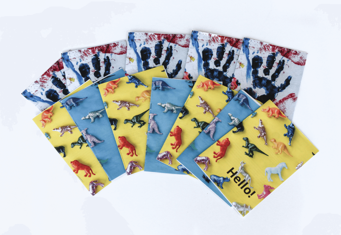
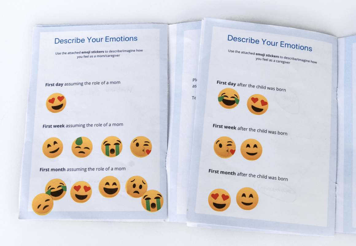
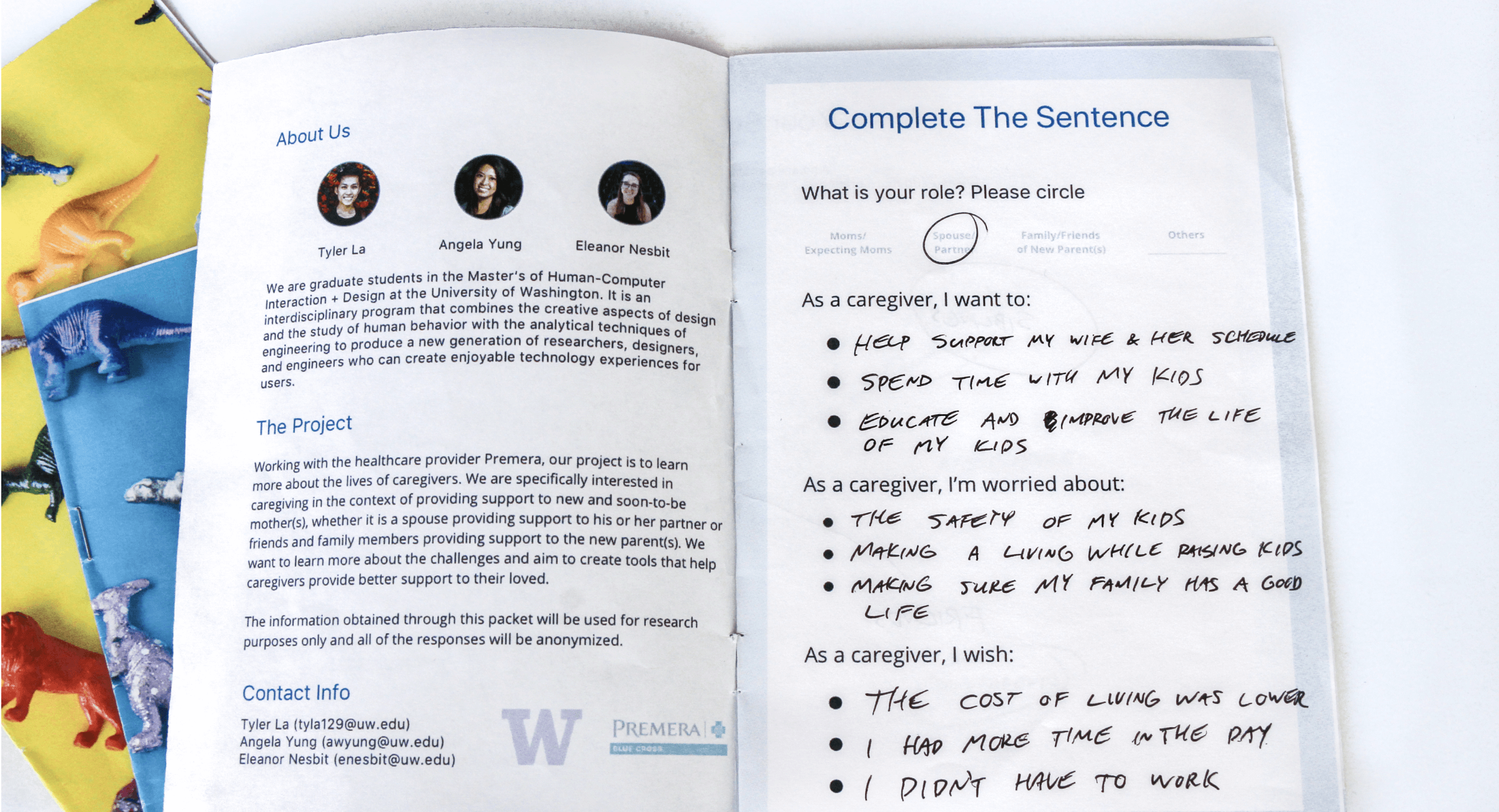
Cultural probes were used to explore the needs, desires, and challenges that new parents face.
Baby changes family dynamics
While becoming parents is a rewarding experience, it takes time for new parents to get adjusted to “the new normal” in their relationships, responsibilities, lifestyles, and identities.
Trying to figure out how much of myself I can give to work, how much of myself I give to the baby, and my relationship with my husband.... Finding kind of your new normal is what I would say the hardest part.
New parents need the right information, at the right time
New parents feel unprepared for parenthood because general information doesn’t respond to the newborn’s specific stage of development and other health conditions.
People said nothing prepared you [for parenthood], but really, nothing prepares you!
Advice from other parents is a valuable resource
New parents feel unprepared for parenthood because general information doesn’t respond to the newborn’s specific stage of development and other health conditions.
My wife and I just really talk to people in our lives who are also parents and ask how do you do this, particular situation is like for you … I think talking to parents who are very realistic about what parenthood is like is very beneficial.

Dads are overlooked
Problem framing
While dads are not experiencing the same physical challenges that moms are, they find it hard to find the balance between giving care to their spouses and taking care of newborns.
From research, we also found that when dealing with stress, men are reluctant to reach out for help due to fear and the social stigma against men showing weakness and vulnerability. About 10% of men reported symptoms of depression following the birth of a child, about double the typical rate of depression in males.
Dads are seen by both parents as “helping” rather than “sharing” parental responsibilities; this induces stress for their roles as new fathers
When it comes to breastfeeding, there is limited support that dads can provide. It is often easier for moms to calm crying babies, leaving dads with regular chores and the feeling of not being helpful enough.
The child just wants her mom [because of breastfeeding] … There are a lot of stuff that as a dad I can’t do. It’s just newborns are all about moms. Our daughter just wants her mom.
Dads are often overlooked in the postpartum journey. The market is saturated with products and services for moms with limited options for dads.
We felt compelled to further narrow our problem space to focus on enhancing the experience for new and expectant dads.
Revised Problem Statement
How might we improve the information seeking process to help dads navigate the postpartum journey?

VR was a potential opportunity
IDEATION
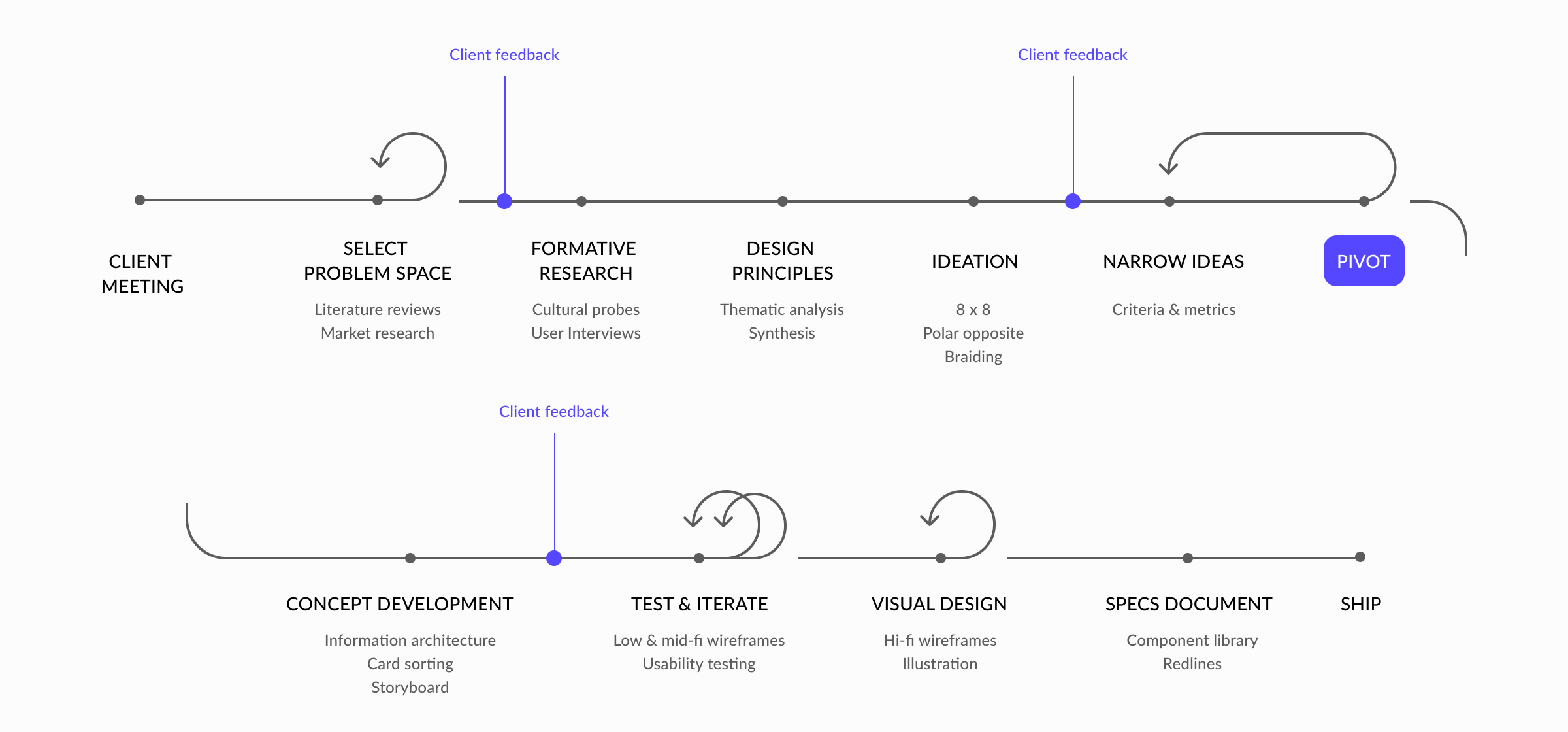
Using brainstorming methods such as 8x8s, polar opposites, and braiding, we ideated 90 concepts as design opportunities in response to the problem statement.
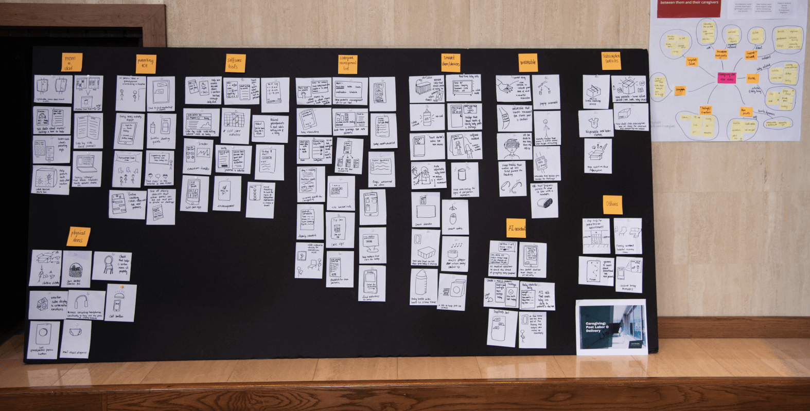
We generated 90 product and service ideas.
Down selection
At the beginning of the down-selection process, card sorting exercise was used to group similar concepts into categories. With feedback from Premera, we narrowed down to 20 concepts. We then utilized the 6 Thinking Hats framework to select 3 potential concepts: AI Assistant, Caregiver Management, and Parenthood VR Simulation.
Storyboarding
Initially, we were interested in the VR simulation idea. The VR simulation is centered around parents not feeling prepared for the reality of parenthood. The experience would allow new parents to practice scenarios that would otherwise be impossible to replicate.
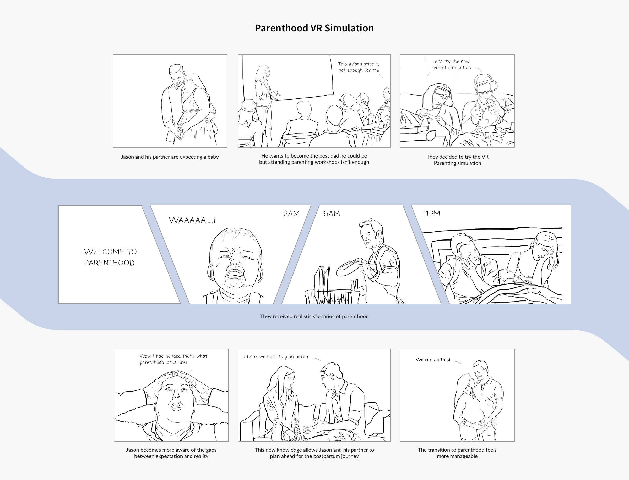
I storyboarded the VR simulation idea to further elaborate the concept.

Take client feedback and pivot

We presented 3 concepts to Premera. After the feedback session, we learned that VR wasn’t a feasible option for the company. Besides, from research insights, we learned that parents value the tips and advice they receive from other parents. Instead of reinventing the wheel, the opportunity was to create a platform that could reinforce the existing mental models.
This is where the concept of Juneau emerged. Juneau helps dads leverage each other’s experience as a resource to navigate through the postpartum journey.

Develop the structure of Juneau
Paper prototyping
In the course of 3 weeks, we tested low- and mid-fidelity prototypes with 9 participants and iterated the design of Juneau. Paper prototype was helpful in catching minor issues such as missing icons and unoptimized app flow.
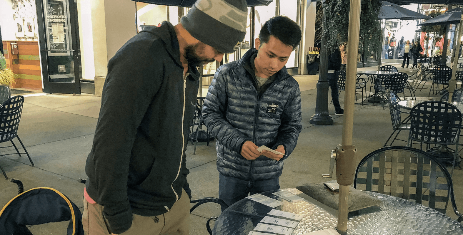
Testing paper prototypes with 9 participants in total to get feedback.
MAIN ITERATIONS
The most prominent theme that came up from user testing was information architecture.
Feedback 1: Lack of metadata prevented content skimming
Missing information like user profile, date posted, comments, or why the system recommends a certain thread to users caused flow inefficiency. Users tapped on the thread only to find out that wasn't the content they were looking for.
Response 1: Add metadata to discussion threads
Relevant metadata was added todo each discussion card so users can skim and find threads they’re interested in without interrupting the flow.
Feedback 2: Unclear taxonomy and information hierarchy
There were overlapping category names and some of them didn't have the same level of hierarchy.
Response 2: Perform an open card sort to clean up information architecture
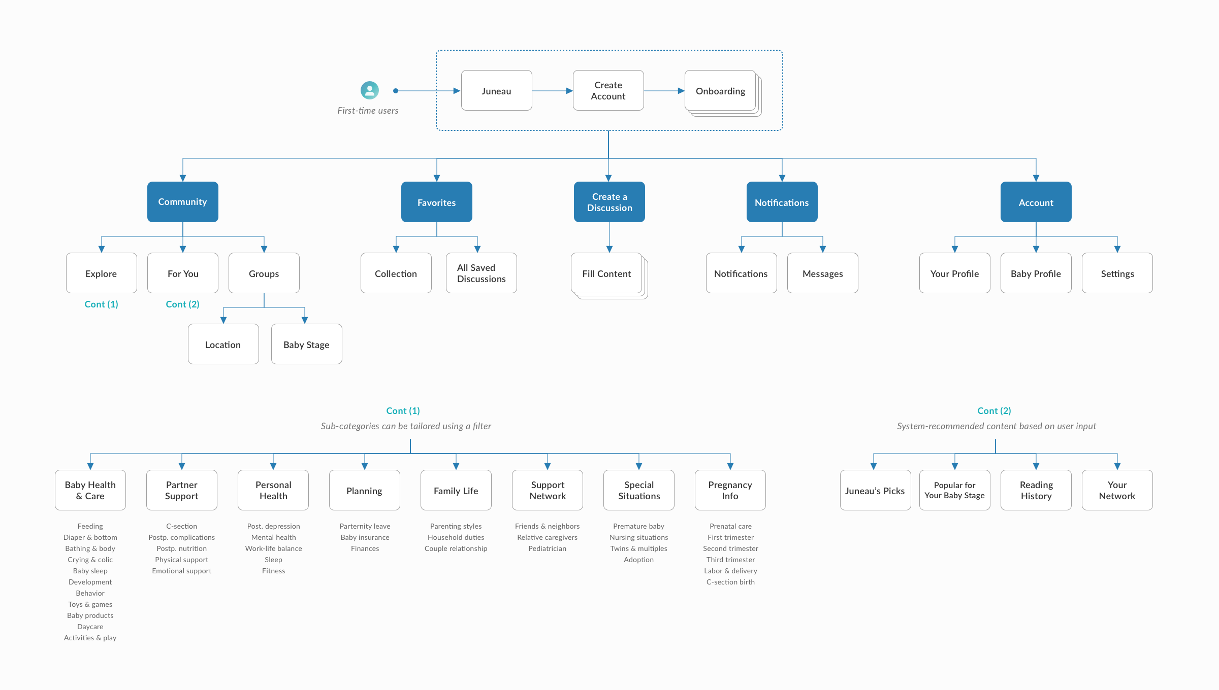
I extracted codes from user interviews and did an open card sort to optimize taxonomy. I then created a site map to put the categories into the appropriate level of hierarchy.
Feedback 3: The flow for content drilling was complex
Within a big category or in a discussion thread, there were subnavigations. Users weren't able to explore content and make decisions quickly.
Response 3: Prioritize features and add a filter
The Timeline page and redundant sub navigations were taken out of the app. A filter was added so reduce information per screen, making the layout less cluttered.
Revision Process

Step 1: I coded and extracted relevant terminology and phrases.
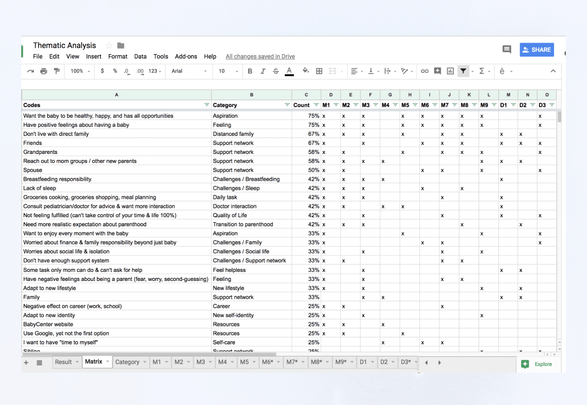
Step 2: I sorted codes into categories in order to refine taxonomy and create a site map.
Site map

Incorporate visual identity
Juneau's design principles are demonstrated in its mood board: a clean, friendly, and modern style that aims to reach all types of dads. Using blue as the primary color, Juneau seeks to promote serenity and calmness. Using green as a secondary color, Juneau brings positivity and freshness, embodying the transition to parenthood.
The postpartum journey is challenging and full of the unexpected, Juneau wants to recognize the need for vulnerability and flexibility through the use of soft gradient waves. The curves and blended colors of these waves mimic the northern light, a natural phenomenon that illuminates the night sky. All these elements are implemented throughout the app to help bring Juneau's visual identity to live while keeping the experience consistent for users.

Moodboard created by Eleanor.
Style guide & Component Library
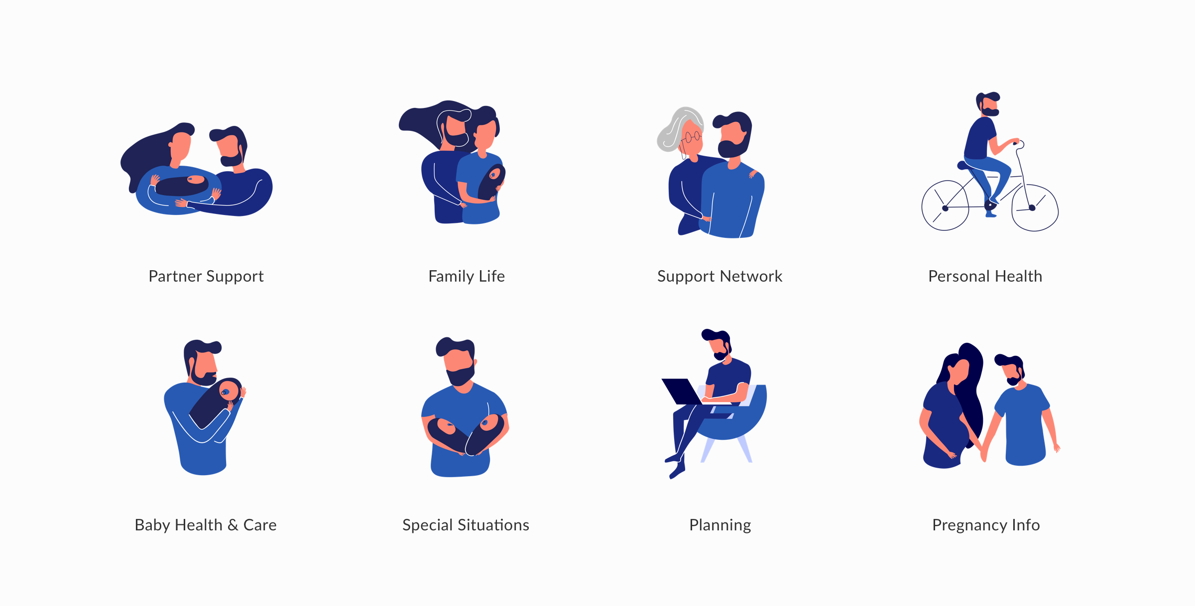
ILLUSTRATION
MOTION DESIGN
Done in After Effects
Outcome
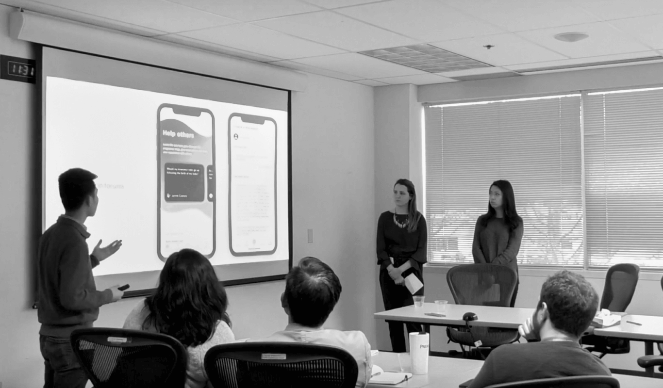
Eleanor, Angela, and I pitched Juneau to Premera and received great enthusiasm from the audience. The hi-fidelity screens and design specifications were given to Premera as a part of the design handoff.
I think this is a great app that we should have pursued. As a new dad, it rings true to me...and you’re right, there’s that stigma [that dads are reluctant to rearch out for help]. You need to get those resources ahead of them and I love how you categorized those information like personal well-being, and baby care, etc. for this app.
- Premera employee
Reflection
What I learned
Extreme users can offer valuable insights
We interviewed 1 mom that had her baby in the NICU and 1 dad with a premature baby. These two users helped our team uncover new challenges that we did not think of. Including this audience added another layer of complexity which helped us think about edge cases and unconventional needs, situations, and contexts.
My background in marketing benefits me as a designer
I was able to leverage my market research skills to evaluate Juneau’s value proposition and account for implementation feasibility. It further helped me consider common challenges of online communities such as the network effect, “throw-away” accounts, and lurkers vs. content generators.
What I’d do differently
Leverage journey mapping to identify pain points quicker
The postpartum experience heavily depends on time (i.e., the baby’s stages of development). We should have created a journey map before the ideation process to help identify pain points quicker.
Conduct remote usability tests to improve efficiency
Postpartum dads have a lot of family responsibilities. It would have been more convenient for participants if the sessions were conducted remotely.
Next steps
Assess Voice User Interface (VUI) in more details
We didn’t rank VUI as one of the top ideas during the ideation phase because noises can disrupt babies’ sleeping patterns. As newborns enter later development stages and their sleeping patterns become more consistent, VUI could be a promising medium. The handsfree interaction that VUI offers brings about convenience, especially in contexts where parents need to hold and calm a crying baby.
Consolidate Juneau with Premera’s existing mom app
Premera has an app for moms, BestBeginnings. If Juneau was implemented by Premera, the next step is to consolidate both apps to make sure users can have consistent experiences.
